Best Practices for Data Visualization
1. Horizontal Bar »> Vertical Bar
1-1. Understand the Z-Line
Users usually read a visualization from left-to-right, up-to-down
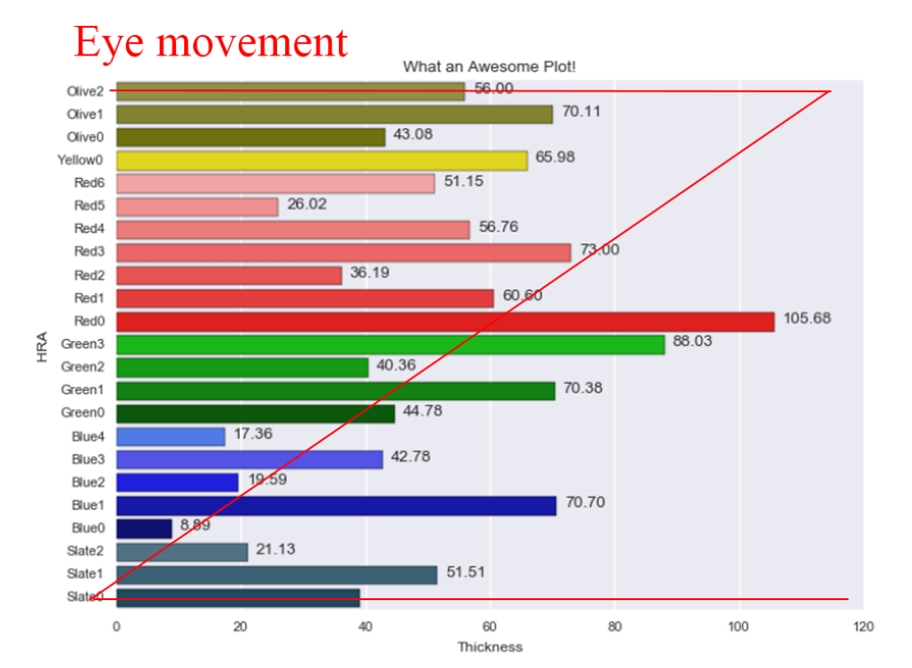
1-2. Sort the Horizontal Bar By x value
- By using a horizontal bar plot AND sorting by x-value, we can put the most important informations in the eye’s z movement.
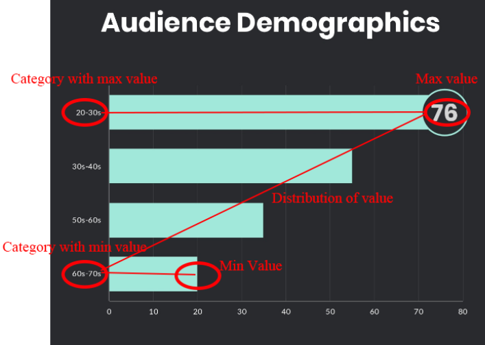
- Because of horizontal plot’s great sync with the eye’s z-movement, this makes horizontal bar plot one of the most effective visualizations
- Label only when specific value is important - otherwise it’s noise
- If doing stack plots, normalize the total sum to 100%
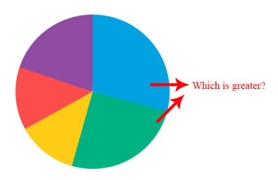
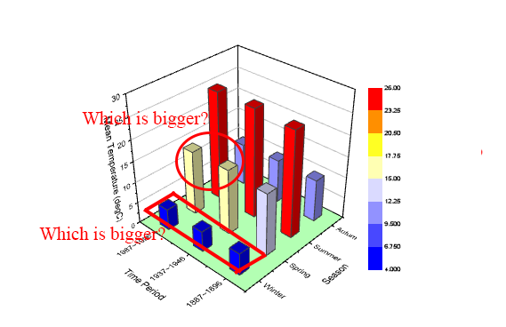
2. NO PIE CHART/3D
- Human eye cannot effectively distinguish size of high dimesional polgons - pie chart and 3d chart
- 2D area graph is also mostly bad, only good use is when comparing data that greatly vary in size
3. Simple is Better - Power of Text
- If there is only a few important numbers that you want to show, simple text could be better any complex graph